
identity design · marketing strategy
Building a responsible enterprise with the aim of improving quality of life, Ridenet Technologies is on its journey towards creating a sustainable future.
RIDENET LLP
TECHNOLOGY
2020

THE BEGINNING OF REVOLUTION
THE colour code & LOGO LOGIC
The logo is designed combining the initials of the concept Ridenet based on Ride and Networking, with the speck at the center depicting the arrival. The Colour scheme is chosen attributing the characteristics the app represents, blue embodying safe rides, and orange symbolizing warmth and happiness associated with networking.


MAKING RIDENET HUMAN
The creation of mascots of the brand went through a transformation from 2D to 3D to bring the brand to life, and establish a more human connection, adding to the face and identity of the brand with the low poly models.

CREATING AN ANIMATED WORLD
The 3D Models, and animation helps in building a dynamic world empowering the brand.
Creating a motion identity for the brand with seamlessly looped animations helps create the perfect environment to express the brand's story.
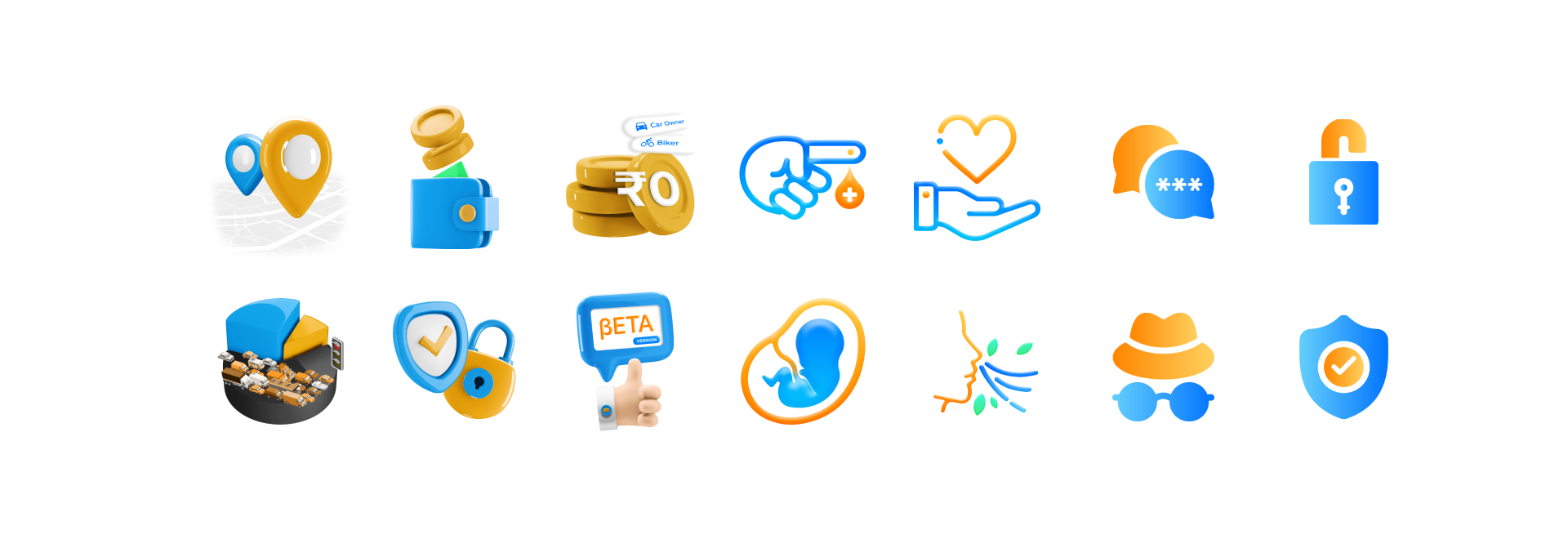
Leveraging symbolism, and 3D style iconography to denote and characterize the different benefits and accredit them in the form of specific symbols designed using the colour scheme of Ridenet.
RIDENET REACHING PLACES
Wielding the power of OOH Advertising to showcase what the brand has in store, taking the brand to various places to fulfill its purpose and objectives,
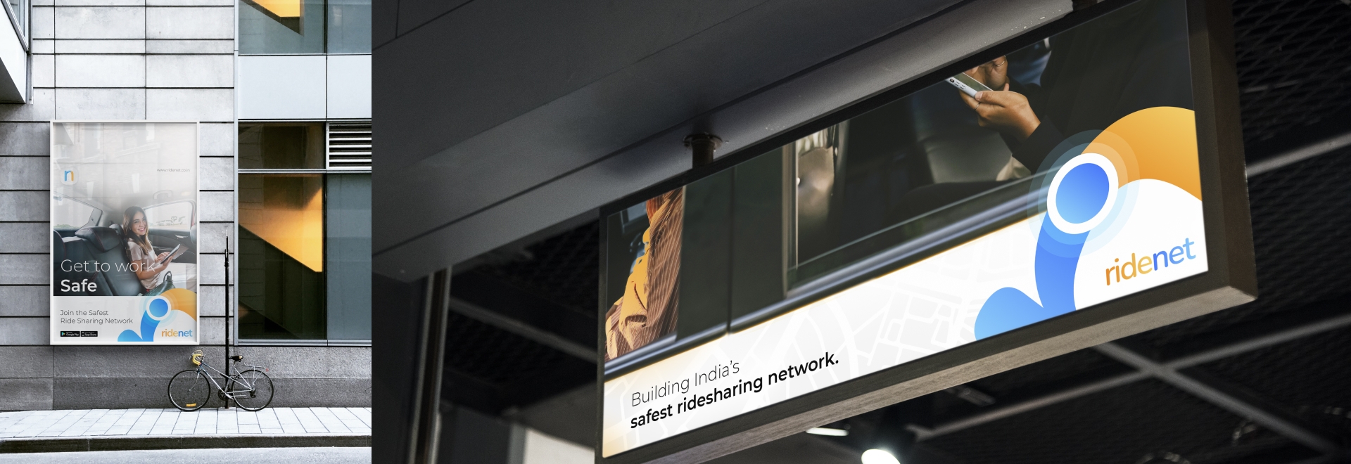
Fabricating, and building a safe ecosystem for daily commuters, not limiting itself to just being a service provider, but having an impact that is much larger.